Color Psychology in Dining Environment Design
The colors surrounding diners have a profound impact on their mood, appetite, and overall dining experience. From warm reds that stimulate conversation to calming blues that encourage relaxation, understanding color psychology helps restaurant owners and designers create spaces that align with their brand identity and customer expectations. This article explores how strategic color choices in dining environments influence patron behavior and satisfaction.
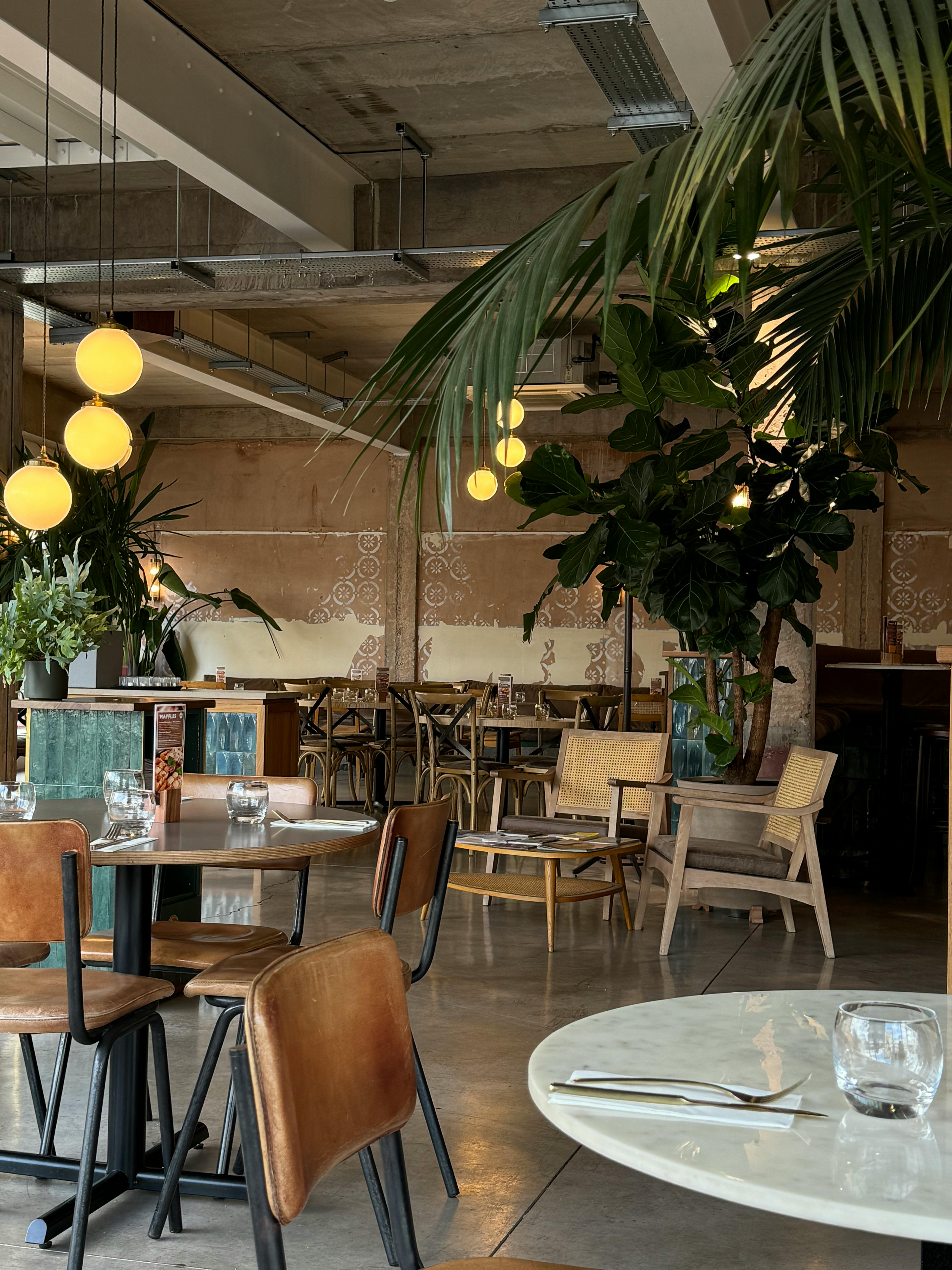
Color choices in restaurant spaces go far beyond aesthetic appeal. Research in environmental psychology demonstrates that specific hues can alter heart rate, influence appetite, and even affect how long customers choose to stay. Restaurant owners who understand these principles can design spaces that enhance the dining experience while supporting business objectives.
How Does Color Influence Appetite and Dining Behavior
Warm colors like red, orange, and yellow have been shown to stimulate appetite and create energy in dining spaces. Red increases heart rate slightly and can make time feel like it passes more quickly, which benefits high-turnover establishments. Fast-casual restaurants frequently use these colors to encourage quicker dining cycles. Yellow promotes feelings of happiness and optimism, making it popular in family-friendly establishments. Orange combines the energy of red with the cheerfulness of yellow, creating welcoming environments that encourage social interaction.
Cool colors such as blue, green, and purple create different psychological effects. Blue tends to suppress appetite and promotes calmness, making it less common in dining areas but effective in bars or lounges where relaxation is prioritized. Green connects diners to nature and health, making it ideal for restaurants emphasizing fresh, organic, or plant-based menus. Purple conveys luxury and creativity, often appearing in upscale establishments seeking to project sophistication.
What Are the Key Restaurant Furniture Design and Selection Tips for 2025
Restaurant furniture design in 2025 emphasizes sustainability, flexibility, and multi-functional pieces. Designers increasingly select materials with low environmental impact, including reclaimed wood, recycled metals, and plant-based upholstery fabrics. Color coordination between furniture and wall treatments creates cohesive environments that reinforce brand messaging.
Ergonomic considerations have become central to furniture selection. Chairs and booths must balance comfort with appropriate dining posture, encouraging guests to enjoy meals without discomfort while maintaining suitable table turnover rates. Modular furniture systems allow restaurants to reconfigure spaces for different group sizes and events, maximizing operational flexibility.
Durability remains essential, particularly in high-traffic establishments. Commercial-grade furniture withstands constant use while maintaining appearance. Color selection for upholstery and finishes should account for maintenance requirements, with darker tones or patterns concealing wear better than light solid colors.
How Does Modern and Functional Restaurant Furniture Support Color Strategies
Contemporary restaurant furniture serves as both functional necessity and design element within color psychology frameworks. Neutral furniture tones like gray, beige, and natural wood allow wall colors and lighting to dominate the psychological impact. This approach provides flexibility for seasonal decor changes or brand updates without replacing expensive furniture pieces.
Contrast strategies use furniture colors to create visual interest and guide customer attention. Dark furniture against light walls creates definition and sophistication, while light furniture in darker spaces can make areas feel more spacious and airy. Accent pieces in bold colors draw eyes to specific zones, such as bar areas or featured seating sections.
Texture and material choices interact with color to enhance psychological effects. Warm wood tones amplify the appetite-stimulating properties of warm color schemes, while metal and glass furniture complement cool color palettes in modern establishments. Upholstery colors should harmonize with overall schemes while meeting practical durability standards.
What Role Does Lighting Play in Color Psychology
Lighting dramatically affects how colors appear and their psychological impact. Natural daylight renders colors most accurately and creates inviting daytime dining environments. Warm artificial lighting enhances reds, oranges, and yellows, intensifying their appetite-stimulating effects during evening service. Cool lighting can make blue and green tones more prominent, supporting specific ambiance goals.
Dimmable lighting systems allow restaurants to adjust color perception throughout service periods. Brighter lighting during lunch service energizes spaces and encourages turnover, while dimmed evening lighting creates intimacy and encourages longer stays with higher per-table revenue. Strategic accent lighting highlights architectural features or artwork, adding visual layers to the color experience.
Color temperature of light sources matters significantly. Warm white bulbs (2700-3000K) create cozy, traditional atmospheres that complement warm color schemes. Neutral white (3500-4100K) provides balanced lighting suitable for various concepts. Cool white lighting (5000K+) appears clinical and generally suits only specific modern or minimalist concepts.
How Can Restaurants Balance Color Psychology With Brand Identity
Successful restaurant design aligns color psychology principles with brand positioning and target demographics. Fine dining establishments typically employ sophisticated color palettes with deep jewel tones, blacks, and metallics that convey exclusivity and justify premium pricing. Casual concepts use brighter, more energetic colors that signal approachability and value.
Cultural considerations influence color perception and acceptance. Colors carry different meanings across cultures, requiring thoughtful selection for diverse customer bases. Red signals good fortune in some Asian cultures, while white represents purity in Western contexts but mourning in others. Researching target demographic preferences prevents unintended psychological responses.
Consistency across touchpoints reinforces brand recognition. Colors used in dining spaces should coordinate with logos, menus, websites, and marketing materials. This consistency builds subconscious associations that strengthen brand recall and customer loyalty over time.
What Practical Steps Support Effective Color Implementation
Begin with comprehensive planning that considers concept, target audience, and operational requirements. Create mood boards combining paint samples, furniture swatches, and lighting examples to visualize how elements interact before committing to purchases. Test color combinations in small areas or through digital renderings to evaluate psychological impact.
Consult with professional designers experienced in hospitality environments. Their expertise helps avoid common mistakes like overwhelming spaces with too many competing colors or selecting impractical finishes that show wear quickly. Professional guidance ensures color choices support both aesthetic and business objectives.
Plan for maintenance and longevity when selecting colors and finishes. High-traffic areas require more durable, forgiving color choices than occasional-use spaces. Budget for periodic refreshes that keep environments looking current without complete redesigns. Document color specifications and product sources for consistent touch-ups and future expansions.
Understanding color psychology empowers restaurant owners and designers to create dining environments that enhance customer experience while supporting business goals. Strategic color application, coordinated with thoughtful furniture selection and lighting design, transforms ordinary spaces into memorable destinations that encourage repeat visits and positive word-of-mouth recommendations.

